Today’s update improves literally every single aspect of Pushbullet on Android, no joke.
There’s awesome new functionality, major improvements to existing features, and a completely new and improved design. Yep, it doesn’t get much better than that!
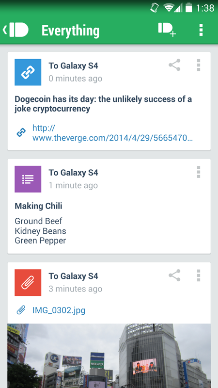
This sounds really cool! So what does it look like now?
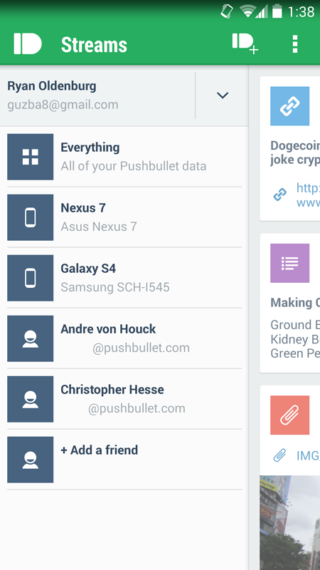
Really sharp right? And the new slider makes it easy to filter your pushes now too!
By tapping on one of the streams on the left (a device or a friend), the app will automatically filter and show only pushes either sent to that device or associated with that friend.
This is really useful. We’ve heard from a lot of people that it can get difficult to find things as they’ve started to use Pushbullet more. We’re hoping this is the first step in making some really big improvements to finding and browsing your pushes in the app!
Awesome, awesome. What’s next? Pushing of course!
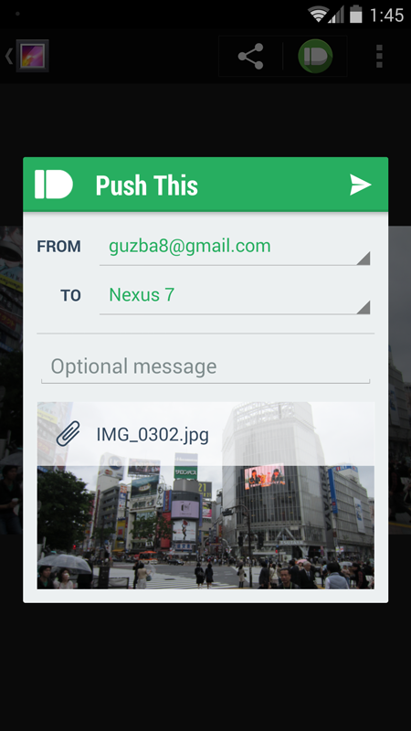
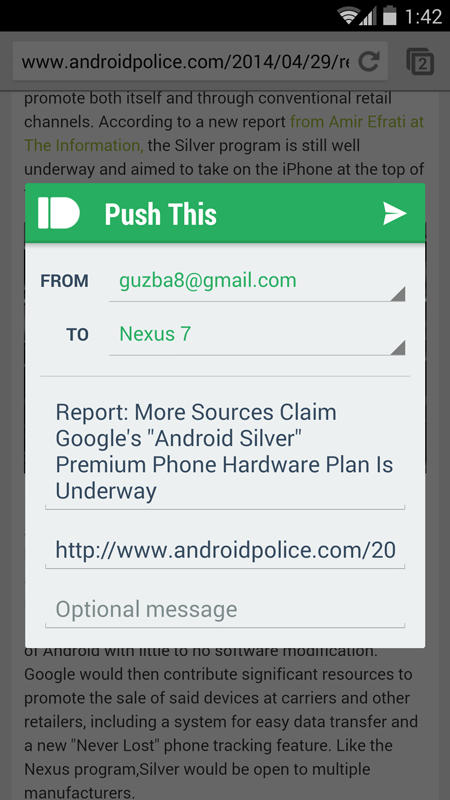
When you share something to Pushbullet now, you’ll no longer get dragged out of whatever you were doing! This might seem small but it feels so much better.
In previous versions of the Pushbullet app, when you shared a link from Chrome or a picture from your gallery, it would pull you out of whatever you were doing and into Pushbullet. Now, you can push something without ever having to leave what you were doing. This means you won’t need to lose your place in an article to push a link ever again!
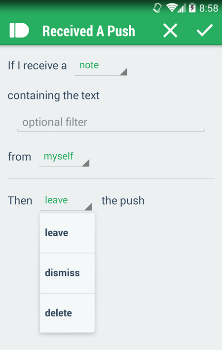
Yep, our Tasker integration got some more love too!
You can now have the push that triggers a Tasker event automatically dismissed or deleted.
We got a lot of feedback on our new Tasker event integration and this was one the highlights: when using a push to trigger a Tasker task, you often don’t want that push to stick around.
There’s now a quick selector allowing you to choose what happens to the push that triggered this event. Should be a great improvement for Tasker’ers everywhere!
That’s not all either (!!!). Here are some other new features:
-
Want to get something over to another one of your devices quick? Now you can broadcast a push to all of your devices. For those with a lot of devices this makes life a lot easier. Once you dismiss the push on any of your devices, we take care of dismissing it everywhere else too!
-
Easily add and switch between multiple Pushbullet accounts. You can add and switch accounts right from the slide-out.
-
Turning Notification Mirroring on or off for specific apps is now a lot easier. Instead of being a giant list of everything on your phone, there’s now a simple list of the apps that have either been muted before or have actually shown a notification. Makes finding the app you want to turn off a Lot simpler!
-
Finding and adding friends in the app is now much simpler. Instead of a huge list of everyone Google thinks you know, it’s now a smaller list of your real contacts. Makes finding the friends you want to share things with a lot less difficult.
-
Improved home and lock screen widget design. Our widget now takes it’s design cue from Google’s updated Email/Gmail widgets. Looks great!
-
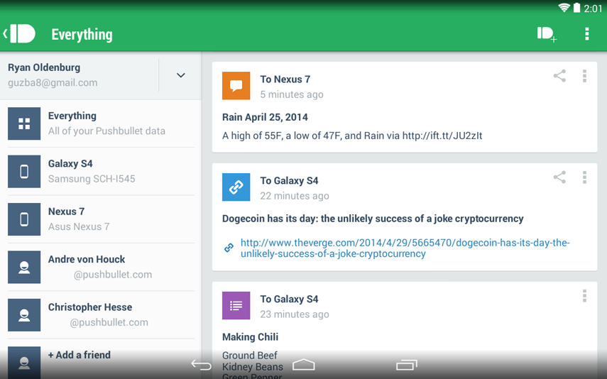
Tablet optimization improved with the new design. It’s really awesome, here’s a sneak peek:
And I’m sure I’m forgetting some. There’s that many!
I’m pretty biased but I think this qualifies as a pretty killer update. What do you think?
We’re always hanging out on the Pushbullet subreddit and can be reached any time at [email protected]. Let us know what you think and what you’d like to see us do next!

