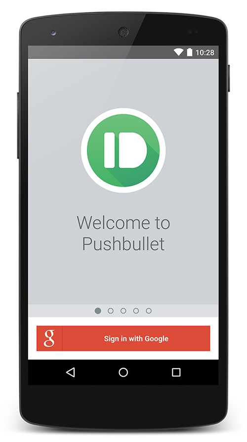
After months of waiting, the next major version of Android, Android Lollipop, is just around the corner. Lollipop introduces an entirely new design language Google is calling Material Design. It begins with a simple notion that if you “focus on the user all else follows” and it makes for the sweetest Android version yet. Material means making sure apps look and feel as good as they work. It focuses on delightful animations and transitions, clear typography, and intuitive navigation and actions.
Being huge fans of great design, we were relieved to have such a comprehensive update to Android, and we did not waste a second bringing as many great things from Material as possible to you.
Faster and easier navigation than ever before
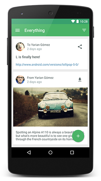
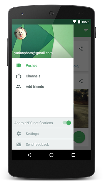
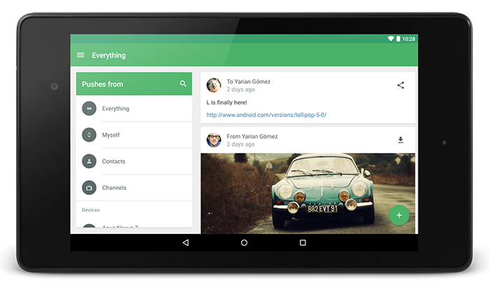
One of the largest improvements we’ve made is to our navigation. Our new drawer enables quick access to channels, settings, and more. Another common request has been the ability to easily turn our awesome notification mirroring on or off which is now possible right from the drawer. We are extremely lucky to have an amazing community of people who give us great feedback, so we’ve also made it easier for you to reach out to us.
Filtering your pushes is now easier too
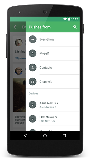
You can still see notifications based on where they came from or who they were sent to, just like before. By using the right drawer or tapping on the filtering icon you should find familiar options, and we’ve made this menu far more useful with the addition of two new features:
-
At-a-glance look at pushes from yourself, your contacts, or your favorite channels. Whether you want to see all of your recent channel pushes, or you are looking for that tiger selfie one of your friends sent you. We got you covered. Oh, and the tiger selfie was from Bob. It’s always from Bob.
-
Convenient search for devices, friends, or channels. If you are a Pushbullet user you are probably incredibly good looking and have hundreds of close friends. With your schedule so jam-packed with awesomeness, you don’t have time to find things by scrolling. We’ve made this easier by baking search right in.
Pushing never looked so good
We streamlined pushing to just one screen. When you share something from another app we will keep you in that app just like before, disrupting you as little as possible. If you are in our app, you can push full-screen, to use every pixel of your 6 inch “phone”. And if you make a mistake and select the wrong photo, you can change it easily.
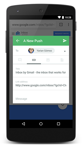
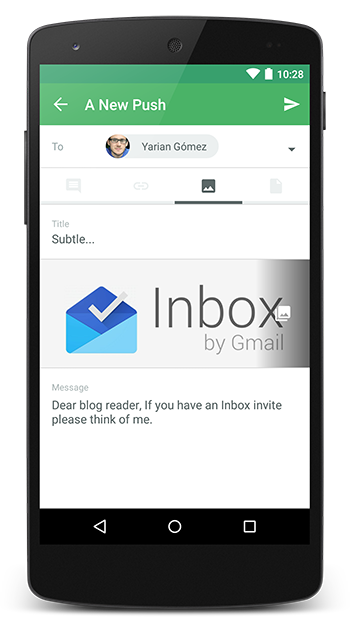
That right screenshot looks really interesting
Options are now at your fingertips
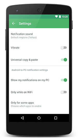
Options are important. So we’ve completely redesigned our settings screen to make things simpler, clearer, and more accessible.
-
Clearer language for settings. Language is clearer so you know exactly what you are enabling or disabling. We also made some of it more accessible so you can find what you’re looking for.
-
One screen. All the options. We get emails from users day in and day out asking how to find certain settings. It shouldn’t be that hard. We’ve made it simple with this update by putting them all in one place. We also reorganized them so things are where you expect them to be.
As always, it looks just as great on tablets
Be delighted by the details
There are dozens of other tiny details all throughout the app. We added floating action buttons, subtle scaling effects, dynamic color theming, status bar dimming, a complete revamping of our iconography, and more to bring a level of polish and care we are extremely proud of. You might very well think we added an easter egg–we couldn’t possibly comment.
We are really excited to share this latest update with all you. For those that have been with us for a while, we thank you for your continuing support. And for those of you who are just joining us…