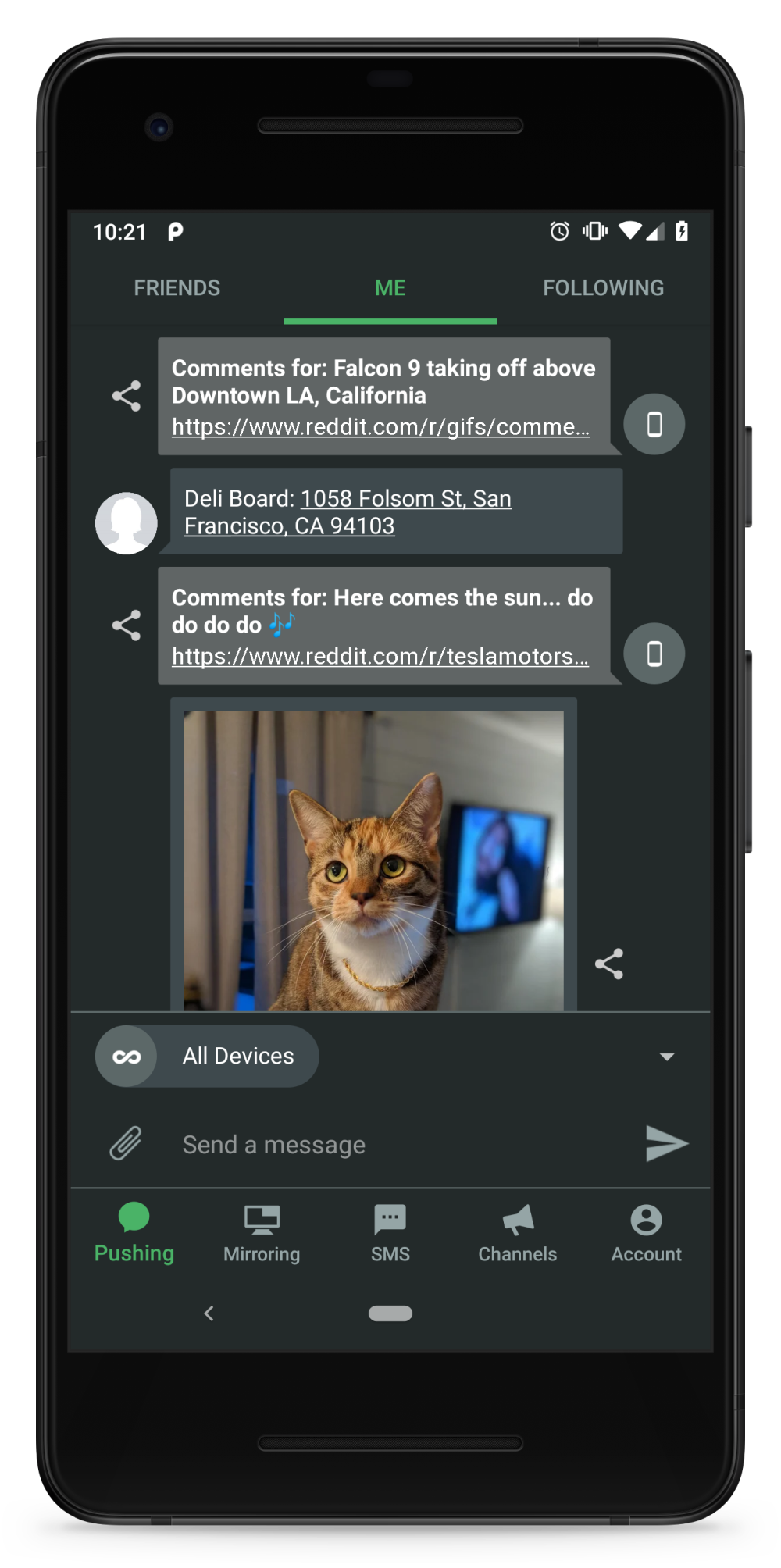
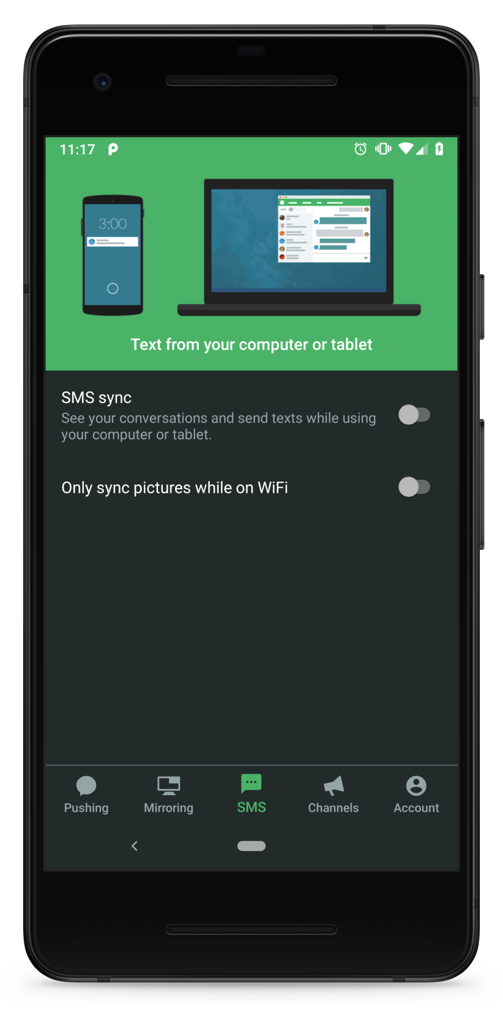
We are excited to release a completely updated UI to our Android beta testers today! Join the beta now to get the new UI and features right away.
We really care that Pushbullet is a great Android app. This is something that has been important to us since the very beginning and remains just as important today. The standards for top-tier Android apps are constantly increasing and we have a long history of updates trying to keep up. Today’s update is the latest addition to this series as we try to make Pushbullet the best possible app we can.
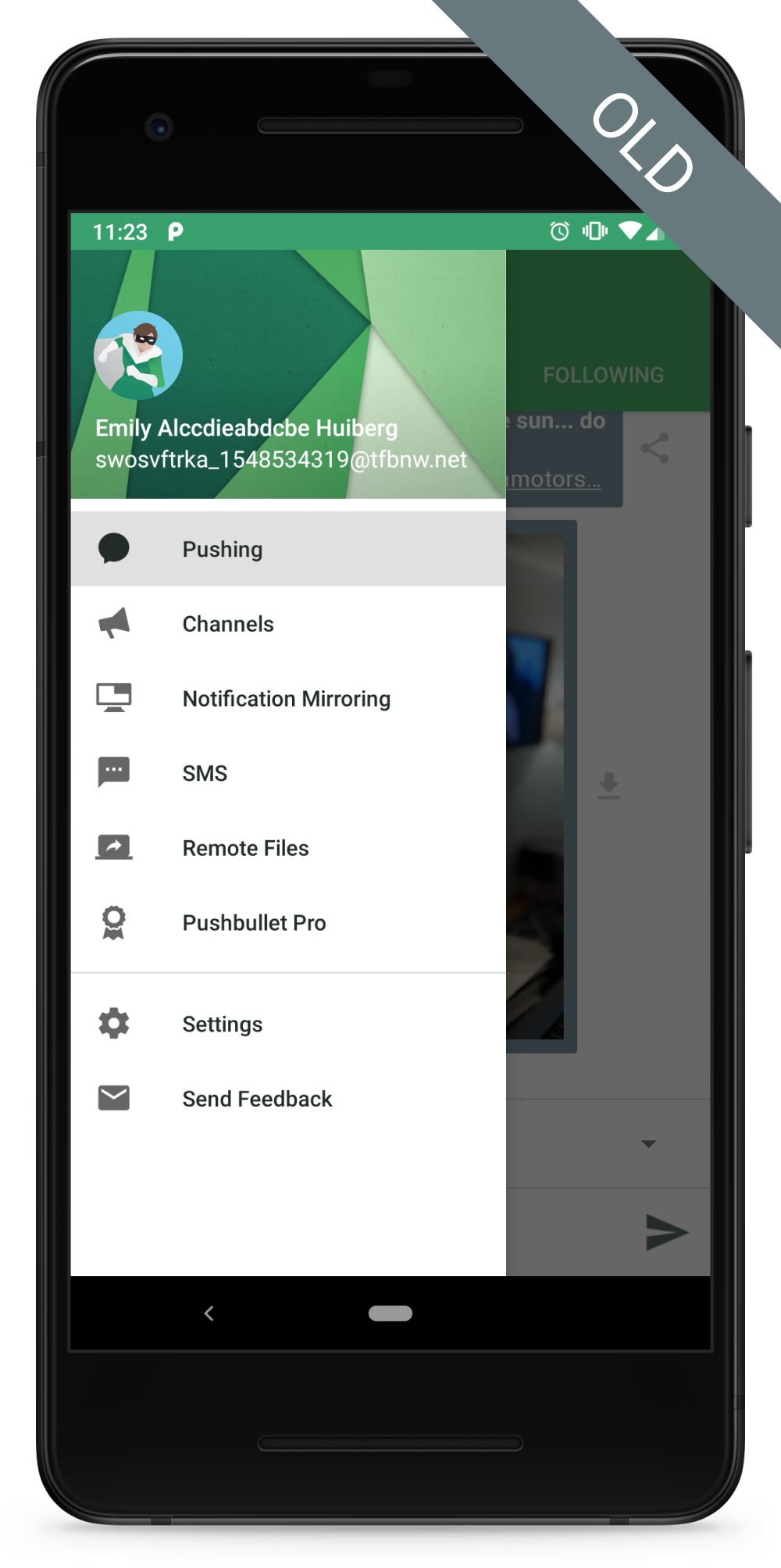
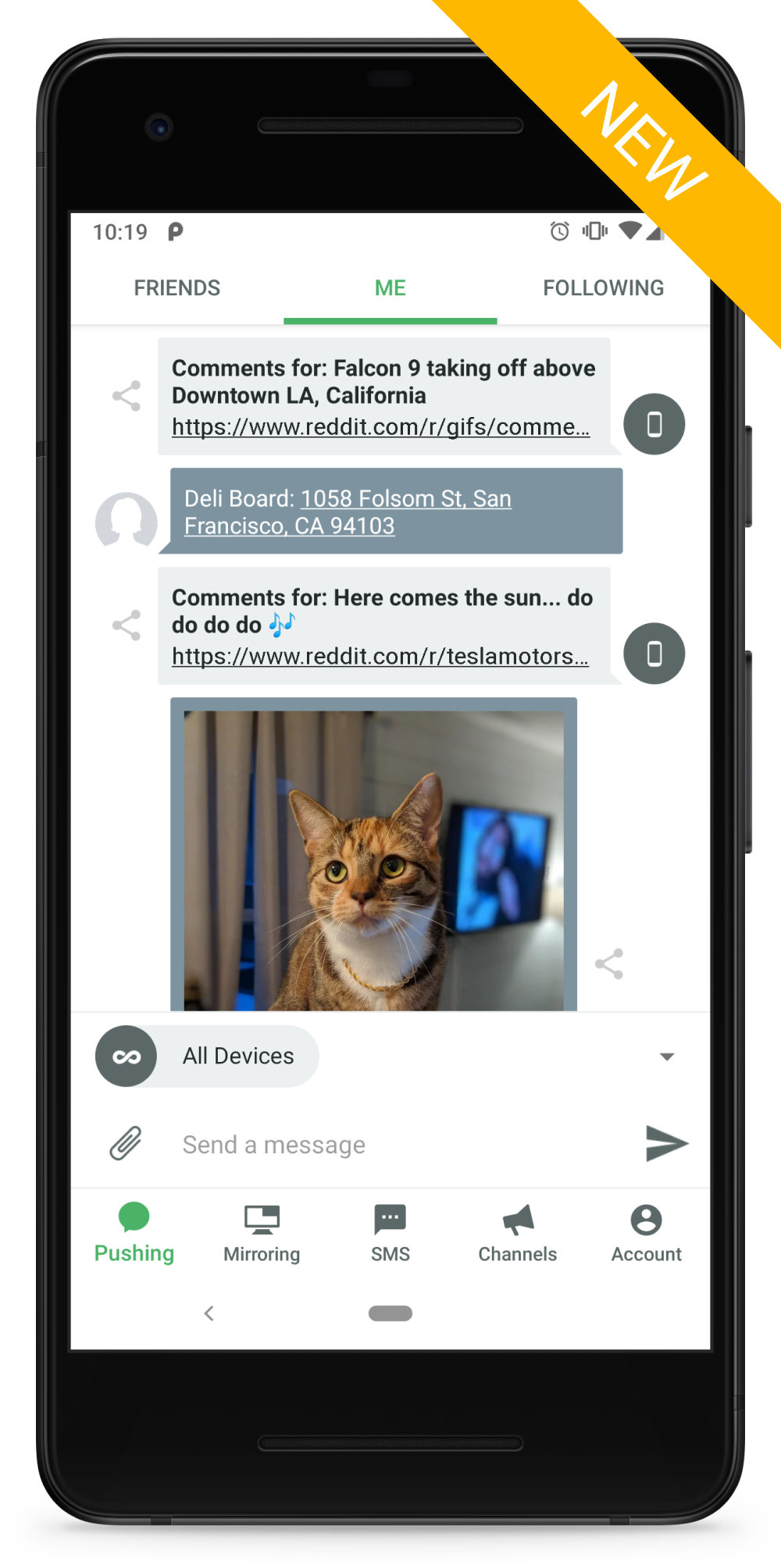
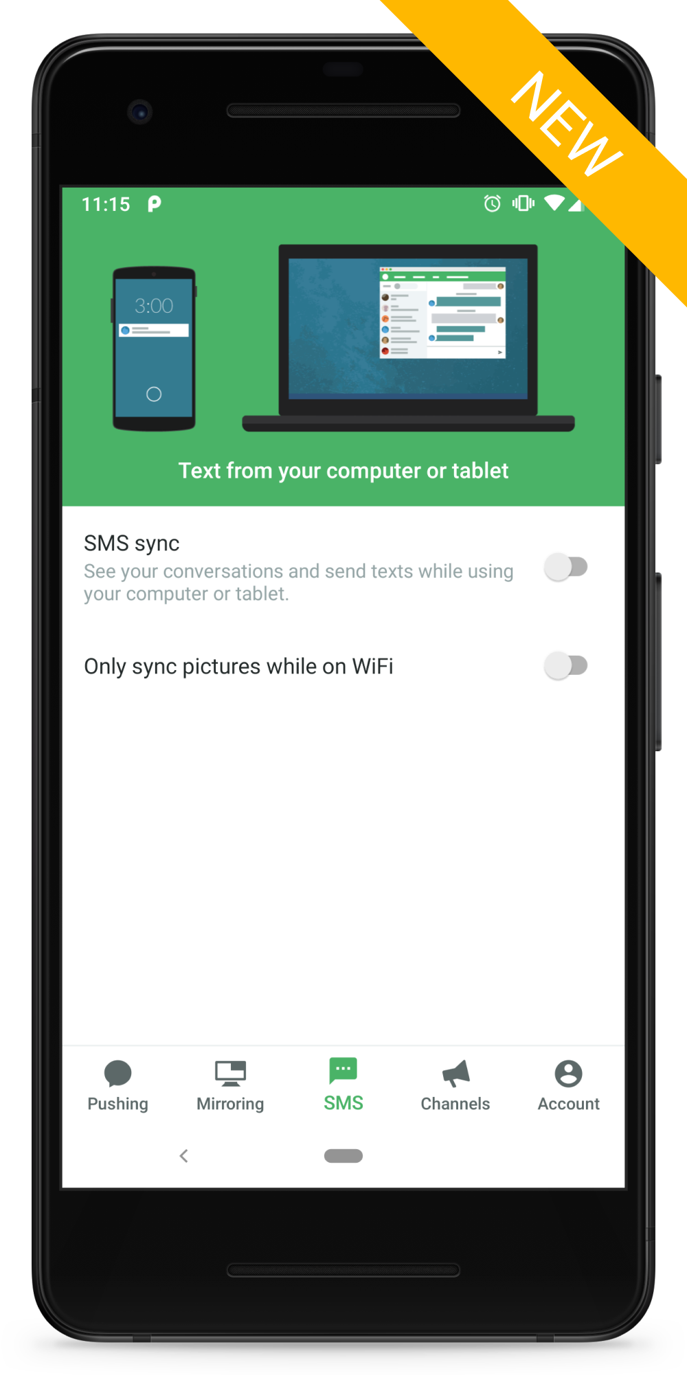
The most significant change we’ve made in today’s update is switching to bottom tabs instead of a drawer for navigation. This is a huge change and while we’re not the first to do it (many Google apps have already made this change including Messages, Phone, Photos, and YouTube), we really like the way it turned out.
The new bottom tabs are easier to use and aren’t hidden away out of sight like the old drawer was. This makes getting around and exploring much easier.
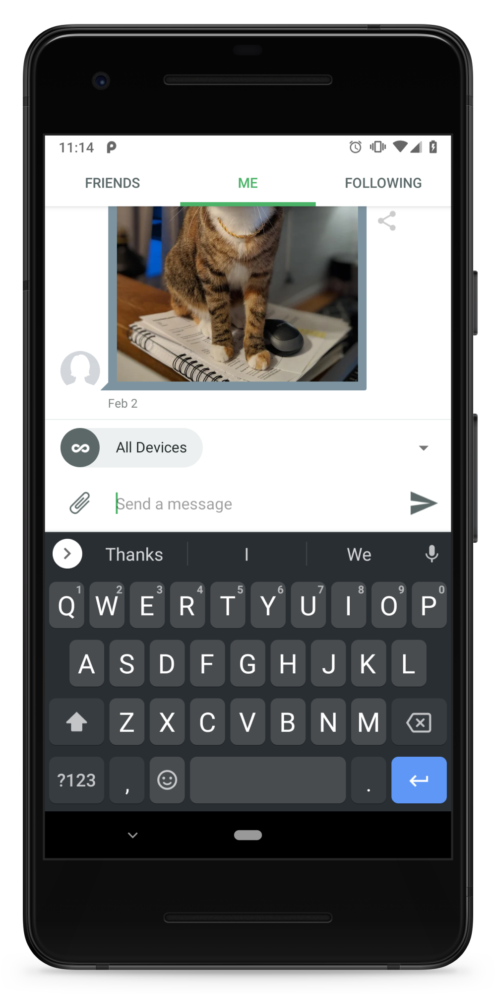
As we tested using the bottom tabs, one little improvement we made that really increased our quality of life was to hide the bottom tabs whenever the keyboard is open. This prevents accidental miss-clicks and avoids wasting screen space while the keyboard is already stealing a bunch of it.
We think you’ll really like how easy and fast the bottom tabs make getting around in the app!
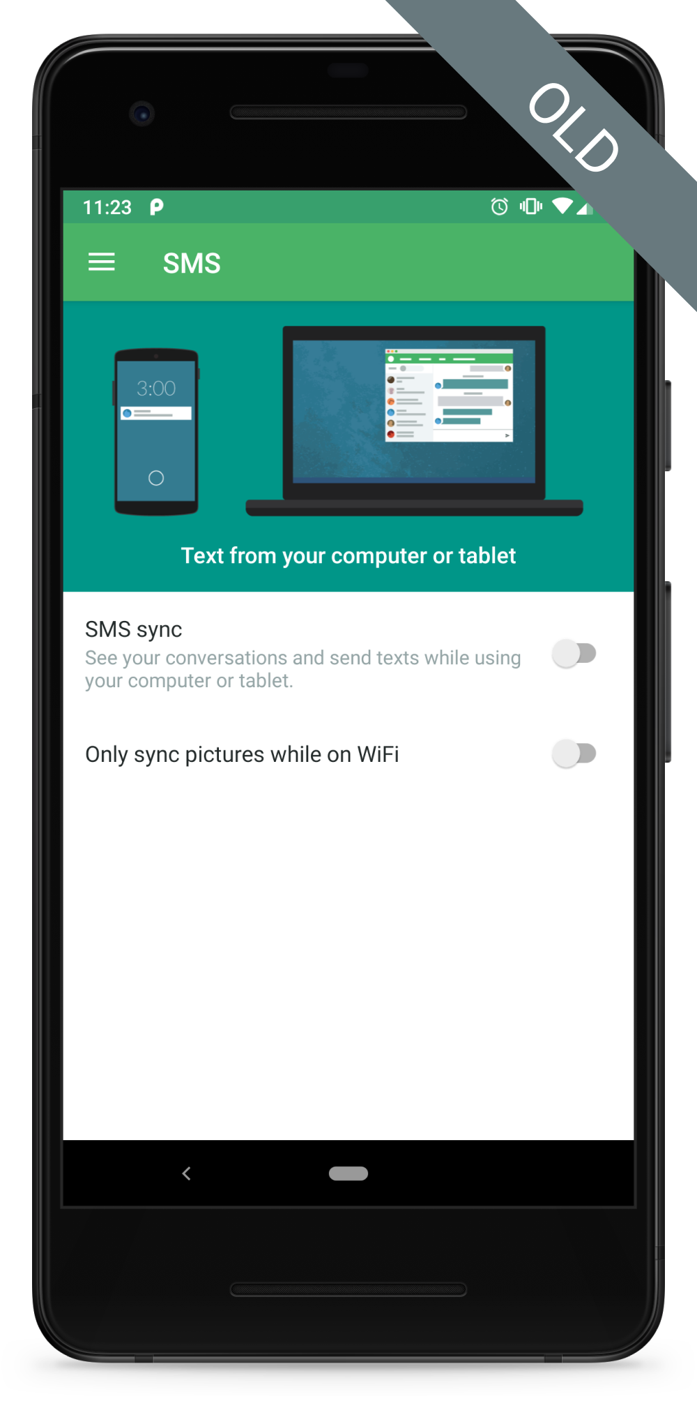
Another great improvement we’ve made is updating the status bar and navigation bar colors based on the screen contents to create a consistent, polished look and feel:
In addition to updates inside the app, we’ve also updated our app icon to be an adaptive icon! Adaptive icons enable apps to have home screen icons that are consistent with other apps and enable different home screens to use custom shapes and effects:
As an extra special treat, we’ve also added support for dark mode for our Pro users! Dark mode is much easier on the eyes in dark rooms or at night, and may even save you battery life. We know some of you really like dark mode so we tried to make it perfect:
These have been just a few sneak peeks at the improvements we’ve made in today’s update. The update is now available to our beta testers and we’ll have it out to everyone soon. We hope you like it as much as we do!
Trying out the update and have some feedback for us? We’ll be watching the comments below and on the Pushbullet subreddit. Please let us know about any issues you run into!

